
Parameter estimation#
It is important to distinguish between the population parameters of a distribution and their sample estimates. To understand the difference, let’s begin by imagining a giant ball pit with 10,000 balls. Each ball is either red or green, but we don’t know how many of each color there are.

You have three minutes to make the best possible estimate of how many red balls there are. This clearly isn’t enough time to look at every ball in the pit, so we will have to come up with another way to estimate the proportion of red balls.
A good solution is to take a random sample of the balls in the pit and use that sample to infer something about the rest of the balls that we didn’t examine.
In this example, the number of red balls, \(Y\), is described by a Binomial distribution, \(Y\sim B(N,p)\). Each ball is either red (a “success”) or not (a “failure”). We have \(N=10000\) “trials.” We know that each ball has a probability of success \(p\), but we don’t know what that probability is. (If our ball pit looked like the one in the picture, with more than two colors, we would use the Multinomial distribution instead.)
For example, suppose that in the three minutes we are able to look at 180 balls, and we find that 66 of them are red. Our sample estimate of the proportion of red balls is \({66\over 180} = 0.3667\). This is an estimate of the unknown population paramter \(p\), which we’ll denote by \(\hat p\). We can think of this estimate as a prediction about the truth for this larger population that we don’t know. (In machine learning, the population value is also called the ground truth.)
We saw previously that the expected value of a Binomial distributed random variable is \(\E(Y) = Np\), so using our estimate \(\hat p\) we would estimate that there are
red balls in the ball pit.
The entire field of statistics seeks to understand properties of an estimate like this. One result, which is probably pretty intuitive, is that the bigger our sample, the more accurate our estimate will be. If instead of looking at 180 balls we were able to look at 500 balls, we could be more confident that our estimate of \(p\) that is closer to the truth; with a sample of 9,000 balls we’d know with very high certainty that we are close to the truth. Actually, we can use statistical reasoning to know how close we can expect our estimate to be to the truth, as we’ll see below.
Sample mean#
In general, we estimate distribution parameters using sample analogues of population values. That is, we replace population values with their corresponding estimates from the sample. Recall that the expected value of a random variable is
We have data for a sample of \(n\) observations from the population, \(x_1, \ldots, x_n\). If we assume that each observation in our sample is equally likely to be in the sample — that is, we are sampling randomly—then the probability of any outcome \(x_i\) is simply \(1/n\). Therefore, the sample estimate of \(\E(X)\) is
That is, we simply replace the population parameter \(\P(x_i)\) with its sample analgoue—the probability of observing the value in the sample, or \(1/N\).
We can use simulations to see how these estimates work. Here, we’ll simulate a ball pit that has exactly 4,000 red balls so the population parameter \(p=0.4\). The “pit” is simply an array of length 10,000, with 4,000 ones and 6,000 zeros.
# Simulate a ball pit with 4000 red balls and 6000 green balls
# red=1, green=0
balls = np.array([1]*4000 + [0]*6000)

# Randomize the balls
rng.shuffle(balls)

# Count red balls and total balls
print(balls.sum())
print(len(balls))
4000
10000
# Take a sample of 180 balls
sample = balls[:180]

sample
array([1, 0, 1, 0, 0, 1, 1, 0, 0, 0, 1, 0, 0, 0, 0, 1, 1, 0, 0, 0, 0, 0,
       0, 1, 1, 1, 1, 1, 0, 1, 0, 1, 1, 1, 1, 0, 0, 0, 1, 0, 0, 1, 0, 1,
       1, 0, 1, 0, 1, 0, 1, 1, 0, 1, 0, 1, 1, 1, 1, 1, 1, 1, 0, 1, 0, 0,
       0, 1, 0, 0, 0, 0, 0, 0, 0, 1, 1, 1, 1, 1, 0, 0, 0, 1, 0, 1, 0, 1,
       0, 1, 1, 0, 0, 0, 0, 1, 0, 1, 0, 0, 0, 0, 1, 0, 1, 0, 0, 0, 1, 1,
       0, 1, 1, 0, 0, 1, 1, 1, 0, 0, 1, 0, 1, 0, 0, 0, 1, 0, 0, 0, 1, 1,
       0, 1, 1, 0, 0, 0, 0, 0, 1, 0, 1, 0, 0, 1, 0, 0, 0, 0, 1, 0, 0, 0,
       0, 0, 0, 0, 1, 1, 0, 1, 1, 1, 0, 1, 0, 0, 0, 0, 1, 1, 0, 1, 0, 0,
       0, 1, 0, 1])
# estimate p with the sample mean
p_hat = sample.mean()

print('Our estimate of p is {:0.3f}, implying an estimate {:.0f} red balls.'
      .format(p_hat, p_hat*10000))
Our estimate of p is 0.433, implying an estimate 4333 red balls.
As we sample more of the data, our estimate becomes more accurate. We might get lucky looking at only 25 observations, but we’ll get far more reliable estimates looking at 5,000 observations.
print('n\tp_hat\tRed balls')
print('-'*25)
for n in [25, 100, 250, 1000, 5000]:
    sample = rng.choice(balls, n)
    p_hat = sample.mean()
    print('{}\t{:0.3f}\t{:.0f}'.format(n, p_hat, p_hat*10000))
n	p_hat	Red balls
-------------------------
25	0.360	3600
100	0.340	3400
250	0.380	3800
1000	0.391	3910
5000	0.399	3992
The Central Limit Theorem#
Any sample we take from the population is just one of the possible samples that we could have taken. It is clear having more observations in a sample makes the estimate more precise, but by how much? In other words, how much variation can we expect there to be between samples? If we repeatedly take samples of 180 balls, will the \(\hat p\) estimates in each sample be similar?
Let’s again use a simulation to see much the estimates vary across samples. The plot below shows three histograms from the following experiment. First, we set a sample size to be \(N \in \{25, 125, 750\}\). For each \(N\), we then take 1,000 independent samples from the population of 10,000 balls and calculate \(\hat p_i\), \(i=1,\ldots, 1000\).
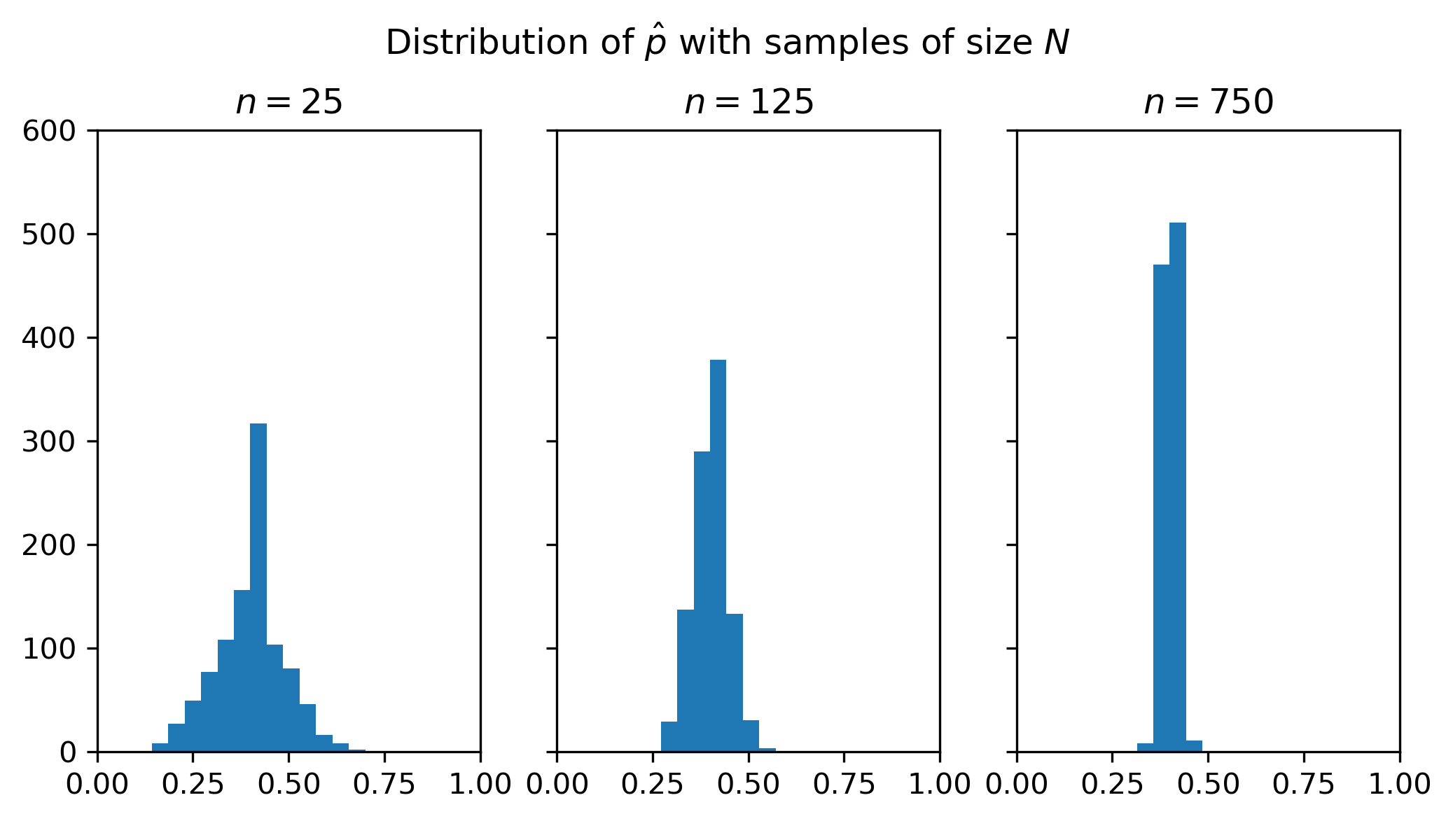
There are three things to notice about the figure:
All of the distributions are centered close to the true value of \(p=0.4\). On average, the sample mean is correct.
The general shape of each distribution is similar to the familiar bell curve of the normal distribution.
There is more variation in the estimate \(\hat p\) across samples when we have a smaller sample size. When \(N=25\), the average estimate is still around 0.4, but in some samples the estimate is less than 0.2 and in other samples it’s above 0.7. As we increase the sample size, the distribution becomes more tightly distributed around the mean. When \(N=750\), almost all of the sample estimates are very close to 0.4.
The code below calculates the cutoff values for a range that contains 95% of the sample estimates for each of the three sample sizes.
for n in p_hats:
    qs = np.quantile(p_hats[n], [0.025, 0.975])
    print('n={}:\t({:0.3f}, {:0.3f})'.format(n, *qs))
n=25:	(0.200, 0.600)
n=125:	(0.312, 0.488)
n=750:	(0.365, 0.436)
The first fact—that the average of the sample mean from different samples is the true mean—is a general fact about the sample mean. In particular, using properties of the expectations operator, we can see that
That is, the expected value of the sample mean is the true expected value. The technical term for this is that the sample mean is an unbiased estimate of \(\E(X)\).
Key fact
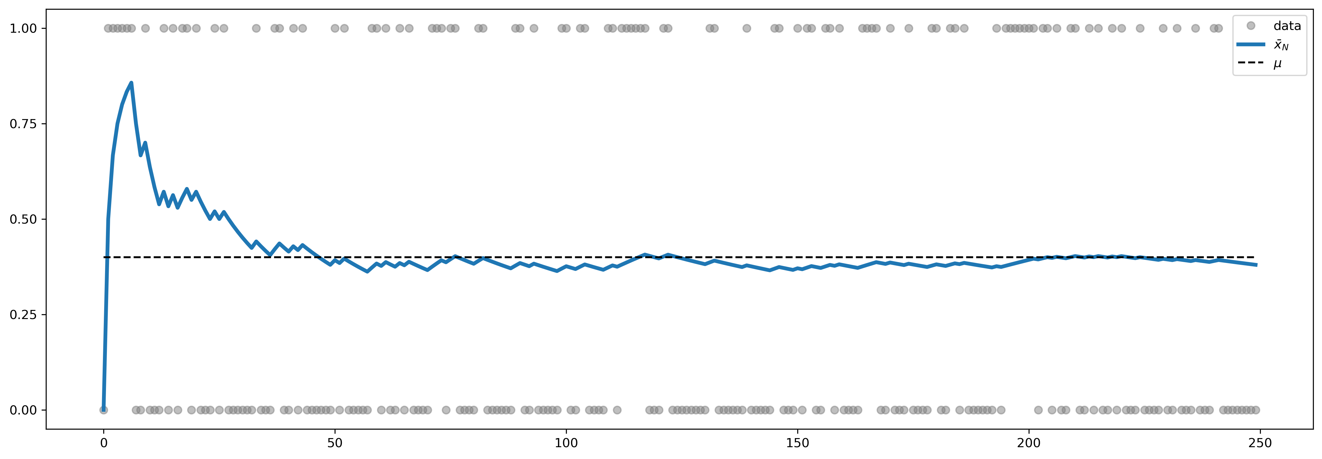
Closely related to the fact that \(\E(\bar x) = \E(X)\) is an important result known as the Law of Large Numbers (LLN), which says that
or that \(\bar x\) converges to \(\E(X)\). This is a statistical “law” that says that—provided certain technical criteria about the random variable \(X\) are met—we can get arbitrarily close to knowing \(\E(X)\) by sampling enough data. An example where the LLN fails is the Cauchy distribution, which we’ll see below.
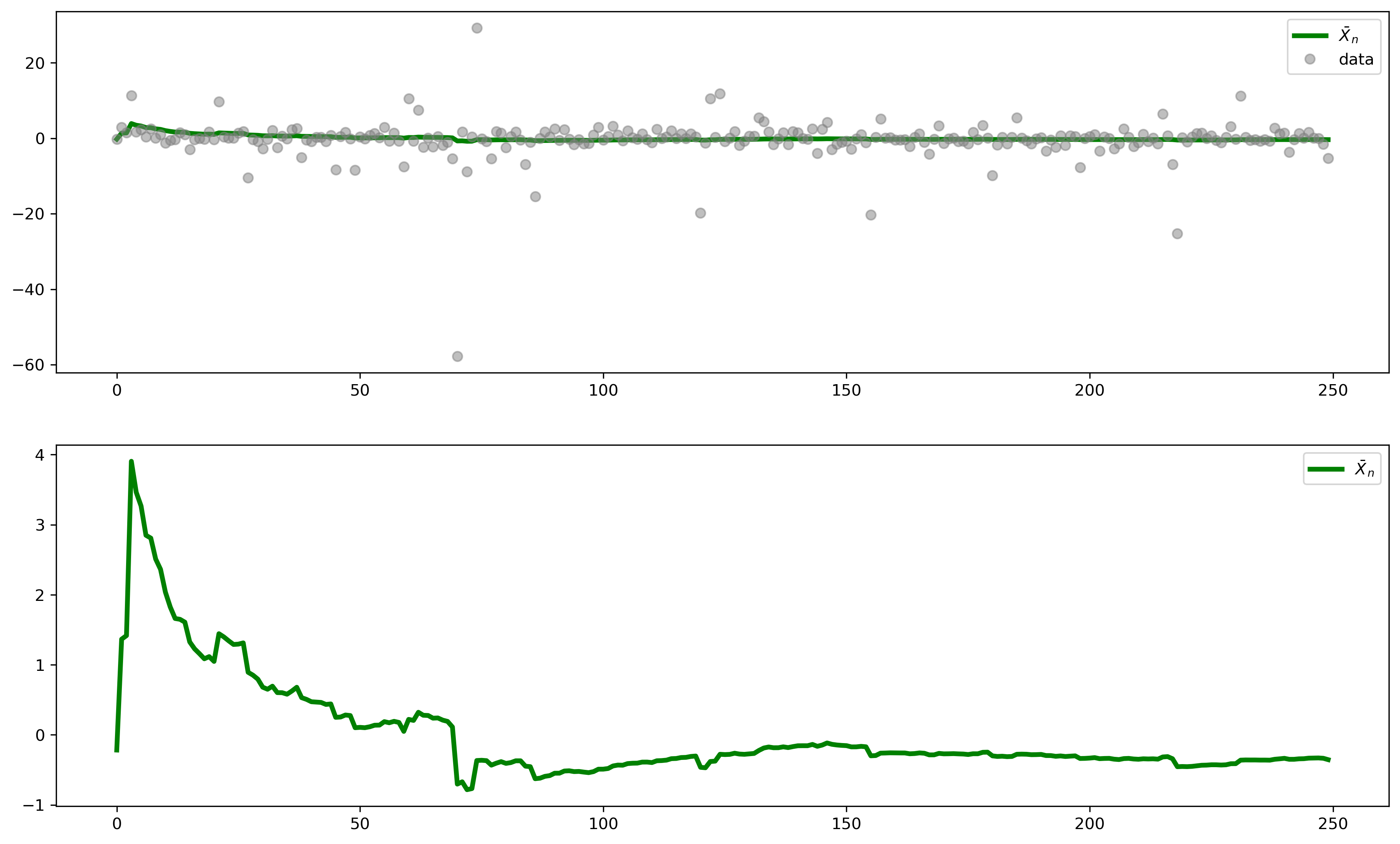
The figure below illustrates the LLN for a Bernoulli random variable. Each dot is an observation from the distribution. The solid line shows the value of \(\bar x_N\) after \(N\) draws. As we have more observations, this average converges to the population value \(\E(X)\).
We can also calculate the variance of the sample mean, which is
As we get more data (that is, \(N \to \infty\)), the variance of the sample mean approaches zero. This is consistent with what we saw above—that we become more certain of exactly what the population mean really is when we have a larger sample.
Key fact
All three facts above are summarized by a fundamentally important result in statistics, the Central Limit Theorem, which says that
where \(\stackrel{d}{\to}\) means “converges in distribution”. The theoretical standard deviation of the mean, \(\frac{\sigma}{\sqrt{N}},\) is called the standard error of the mean.
This is a general statement about any probability distribution (as long as the second moment is finite). In other words, with few exceptions, whatever the underlying distribution of \(X\) is, its sample mean converges to a normal distribution. This allows us to make very specific statments about how confident we are about observing any particular result.
Exercise
Let \(Z=\sqrt{N}\left(\frac{\bar x_n - \mu}{\sigma}\right).\) Show that \(\E(Z) = 0\) and \(\var(Z)=1\).
Solution
Recall that \(\var(a + bX) = b^2\var(X)\) for constants \(a\) and \(b\). Here, \(n\) and \(\mu\) are constants, not random variables. Therefore,
and
The central limit theorem tells us what the distribution of the sample mean is. The figure below displays again the histogram for the means from 1,000 samples of size \(N=25\), along with a normal distribution with \(\mu=p=0.4\) and \(\sigma^2 = p(1-p)/N\).
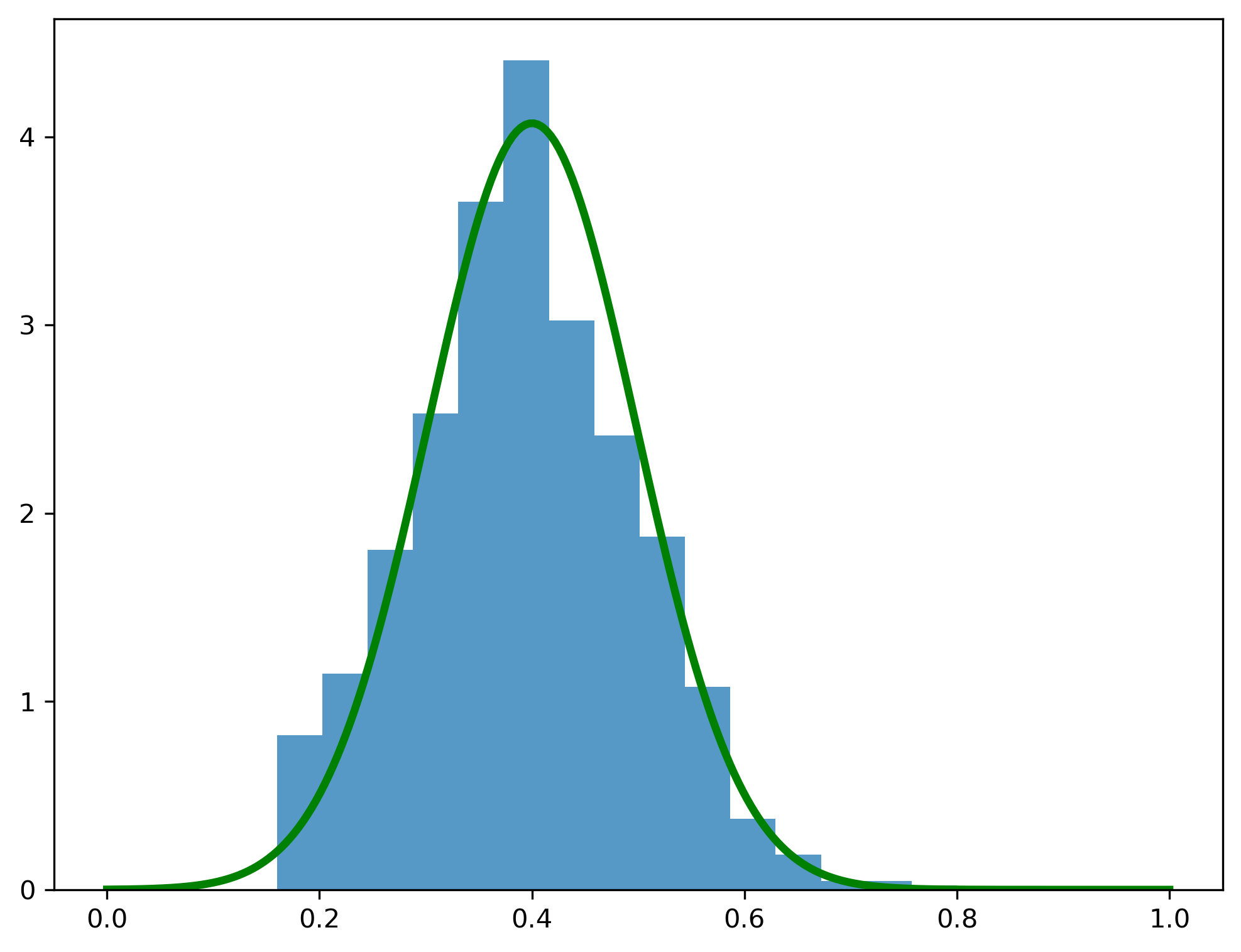
The Normal PDF fits the actual distribution of the mean quite well. In most real-world situations we won’t know the true value of \(\mu\) and \(\sigma^2\), but we already know how to estimate them. Given these two parameter estimates, we can then use the CLT to tell us how confident we can be about these estimates.
For example, if we draw one sample of 180 balls we might get the following:
n = 180

sample = rng.choice(balls, n)

μ = sample.mean()
σ = sample.std()

# standard error of the mean
sem = σ/np.sqrt(n)

print(μ, sem)
0.37222222222222223 0.03603029893993332
The sample mean is np.float64(0.372) and the standard error of the mean is np.float64(0.036). Our best guess for the proportion of red balls is therefore np.float64(0.372), but the CLT also tells us that this estimate has a standard error of np.float64(0.036). Since 95% of the probability in a Normal distribution is within ±1.96 standard deviations of the mean, this means that we can should expect that 95% of the time the true population value of the \(p\) will be between np.float64(0.302) and np.float64(0.443).
The Cauchy distribution#
The LLN does not always hold. Some distributions generate such extreme outliers that the mean, variance, and other moments do not even exist! Yes, we can always calculate a sample mean or variance, but this isn’t a useful estimate of anything.
An example of such a case is the Cauchy distribution. Its PDF is
where \(x_0\) and \(\gamma\) are the location and scale parameters, respectively. Looking at its PDF and CDF, it is not immediately apparent that something is unusual about this distribution. The PDF looks a lot like the Normal. But if you look closely, you see that the tails looks suspiciously fat. And therein lies the problem.
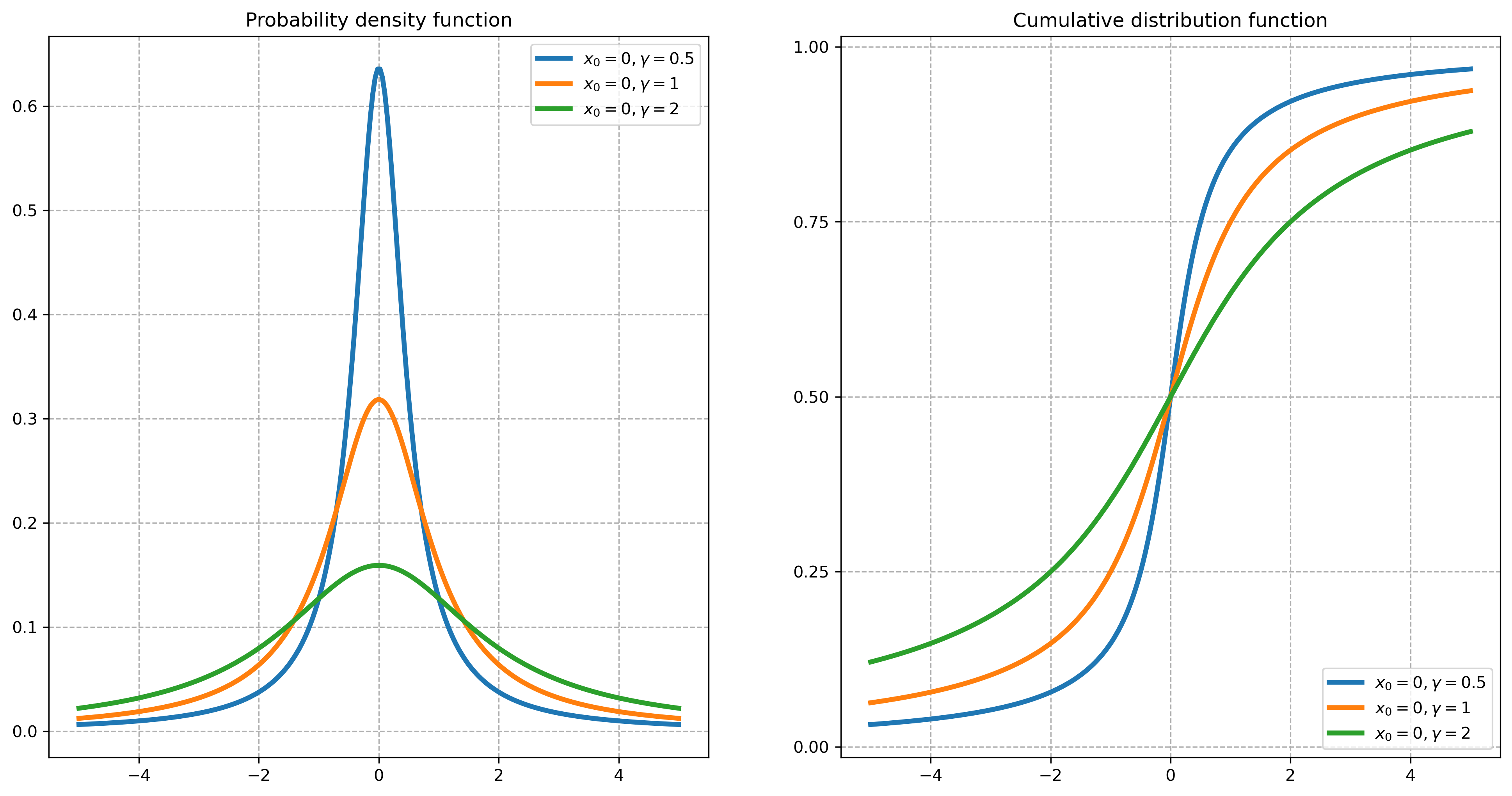
In fact, the mean, variance, and higher central moments of the Cauchy distribution are all undefined. The condition for the LLN that \(E(|X|)<\infty\) therefore fails, and the LLN does not hold.
We can see this in the simulation below. Note the significant scale change in this figure relative to the earlier example; some of the observations are extremely large, and these outliers throw off the scale of the chart—and lead to the phenomenon that there simply is no expected value for these random variables. However much data we collect, the average value of the data will continue to jump around.
Estimating higher moments#
The sample estimates variance, skewness, and kurtosis are, respectively,
# estimate the variance from a sample of 10 draws
scs.bernoulli(p).rvs(10).var()
np.float64(0.25)
# compare to the population variance
p * (1-p)
0.24
# equivalently
scs.bernoulli(p).var()
np.float64(0.24)
Warning
Note the difference between scs.bernoulli(p).var() and scs.bernoulli(p).rvs(10).var(). The former gives the population variance for a Bernoulli distribution, while the latter gives the sample variance from 10 draws of random variables from this distribution.
If \(X\) is normally distributed, \(\hat{S}(x)\) and \(\hat{K}(x)-3\) are asymptotically normally distributed with mean zero and variances \(6/T\) and \(24/T\), respectively.
Sample covariance and correlation#
The sample covariance is
The sample correlation coefficient is
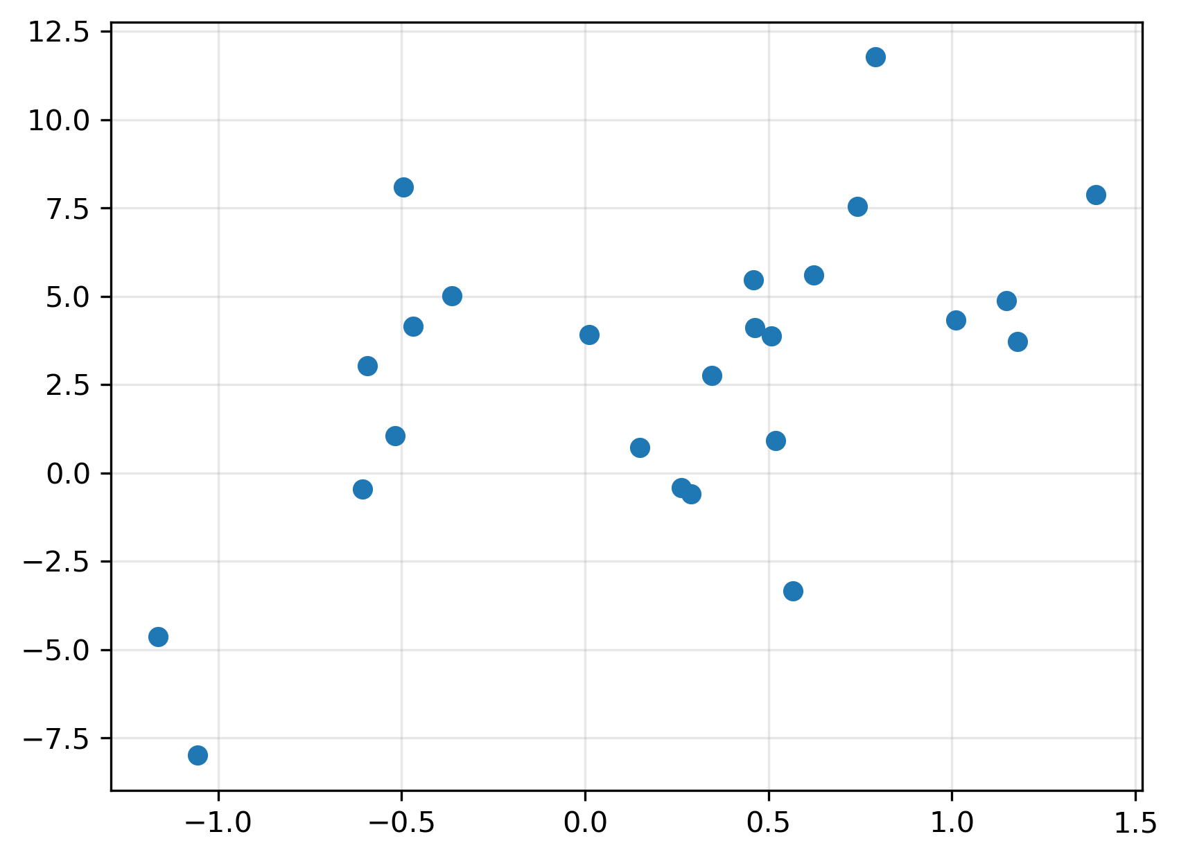
Let’s apply these to some simulated data. We’ll take 10 draws from \(X \sim \N(0,1)\) and then define
where \(\varepsilon_i \sim \N(0,1)\) and is independent of \(x_i\).
So while the \(x_i\) and \(\varepsilon_i\) are independent, \(y_i\) obviously depends on \(x_i\).
Exercise
Given this relation between \(X\) and \(Y\) calculate the theoretical value of \(\cov(X,Y)\). Simply apply the formulas for \(\cov(aX,bY)\) and \(\cov(a+X,b+Y)\) to this case. Write down the variance–covariance matrix for \(X\) and \(Y\) so you can compare it to the estimates we get below.
Solution
Since \(X\sim\N(0,1)\), it’s variance is 1. The variance of \(Y\) is therefore
The covariance is
where we have used the fact that \(\cov(X,\epsilon)=0\), since the two random variables are independent. The variance–covariance matrix is therefore
The correlation is
rng = np.random.default_rng(554321)

n = 25
x = rng.standard_normal(n)
y = 2 + 3*x + 3*rng.standard_normal(n)
Here’s a plot of each of the \((x_i,y_i)\) pairs:
Calculating the sample covariance and correlation is simple:
np.cov(x, y)
array([[ 0.49049555,  1.6112886 ],
       [ 1.6112886 , 18.45685919]])
np.corrcoef(x,y)
array([[1.        , 0.53552148],
       [0.53552148, 1.        ]])
Note
The correct formula for estimating variance has \(N-1\) in the denominator, as shown above. When we have lots of data, it doesn’t matter if we divide by \(N-1\) or just \(N\), so some code will just use \(N\). We can control this in Numpy using the ddof argument. Try running these functions and compare the outcomes.
y.var()
y.var(ddof=1)
np.cov(x,y, ddof=0)
There are several other ways to get do the same calculation:
xy.shape
(25, 2)
xy.shape
(2, 25)
Exercise
Experiment with this simulation by increasing \(N\). Verify that the sample covariance and correlation matrix converge to their theoretical values.
Exercise
Experiment by changing the other parameters in the the equation for \(Y\) and see if the sample mean and variance of the \(y_i\) behave as you expect.
Solution
If we generalize the equation for \(Y\) to be
we can see that
and therefore
Hypothesis testing#
Typically we estimate parameters of a model to test some hypothesis. For example, a large literature investigates whether the equity premium (the excess return of the market portfolio over the riskfree rate) is predictable. A typical regression looks like this:
The coefficient \(\gamma_1\) measures how important some variable \(x\) is in predicting the equity premium. As Welch and Goyal [2008] note, the most prominent \(x\) variables explored in the literature are the dividend price ratio and dividend yield, the earnings price ratio and dividend-earnings (payout) ratio, various interest rates and spreads, the inflation rates, the book-to-market ratio, volatility, the investment-capital ratio, the consumption, wealth, and income ratio, and aggregate net or equity issuing activity.
As we’ll see in the next chapter, we can use data to estimate \(\gamma_0\) and \(\gamma_1\). These estimates are functions of the random realizations of data, and so the estimates are themselves random variables.
To perform a formal statistical test, we begin by stating a null hypothesis. In this case, we might decide that the null hypothesis is that there is no predictability:
The alternative is that \(\gamma_1 \neq 0.\) Since either a positive or negative sign on \(x_{t-1}\) would imply that the variable helps predict the equity premium, we will take evidence that \(\gamma_1<0\) or \(\gamma_1>0\) as evidence against the null.
Note
The null hypothesis is what we believe to be true in the absense of evidence against it. In our judicial system, the null hypothesis is that a person is innocent. Only when there is strong evidence against this do we declare that the person is guilty.
Two types of errors are possible in such a setting. First, we might wrongly conclude that the null hypothsis is false. This is what happens when a person is mistakenly convicted of a crime they did not commit. Second, we might fail to overturn the null hypothesis even though it is in fact false. This is akin to a guilty person going free. The first mistake is called a type 1 error and the second is a type 2 error. There is always a tradeoff between these two types of errors: any test that we devise must prioritize minimizing one or the other type of error. Obviously in our legal system we try to minimize type 1 errors on the undertanding that we will sometimes let guilty people go.
Consider another simple example. Suppose the return on a asset \(i\) during time \(t\) is assumed to be
where \(\mu_i\) is the assets expected return and \(\varepsilon_{i,t}\sim \N(0,\sigma_i^2)\) is the statistical noise in the return.
Exercise
In this model, what is \(\E(R_i)\)? What is \(\var(R_i)\)?
Suppose we wish to test the hypothesis
Our estimate for the expected value, \(\mu\), is simply the average of the \(R_{i,t}\). We saw that the central limit theorem says that \(E(\bar R) = \mu\) and \(\var(\bar R) = \frac{\sigma^2}{T}\). This means that under the null hypothesis the distribution of \(\bar R\) would look like this:
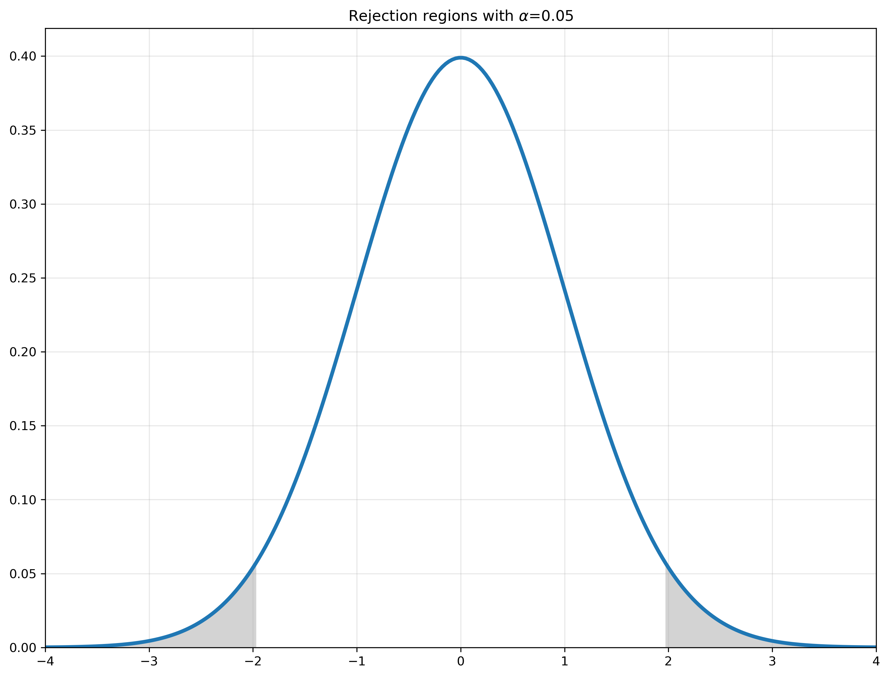
Therefore, if we get a value for \(\hat \mu\) that is in the rejection region we can say that this is a somewhat unlikely outcome if the null hypothesis is true — and therefore we take it as evidence against the null. In other words, if \(\hat \mu\) is much less than –2 or much more than 2 we can reject the null hypothesis.
Here are the cutoff values for a two-sided \(Z\)-test:
for prob in [0.1, 0.05, 0.01, .005]:
    print('{:.1f}%\t{:.3f}\t{:.3f}'.format(prob*100, scs.norm.ppf(prob/2), scs.norm.ppf(1-prob/2)))
10.0%	-1.645	1.645
5.0%	-1.960	1.960
1.0%	-2.576	2.576
0.5%	-2.807	2.807
Check your understanding
Why do we divide the probability by two in norm.ppf(prob/2)?
The idea of a 95% confidence interval should be familiar from hearing about surveys in the news. When pollsters say that their results are accurate “19 times out of 20,” they mean they believe there is a 95% confidence level in the reported data. This suggests that if the same poll were conducted 20 times under the same conditions, the results would fall within the stated margin of error in 19 of those instances (i.e., 95% of the time). However, in one out of 20 cases, the actual results might be outside that range due to random sampling variation.
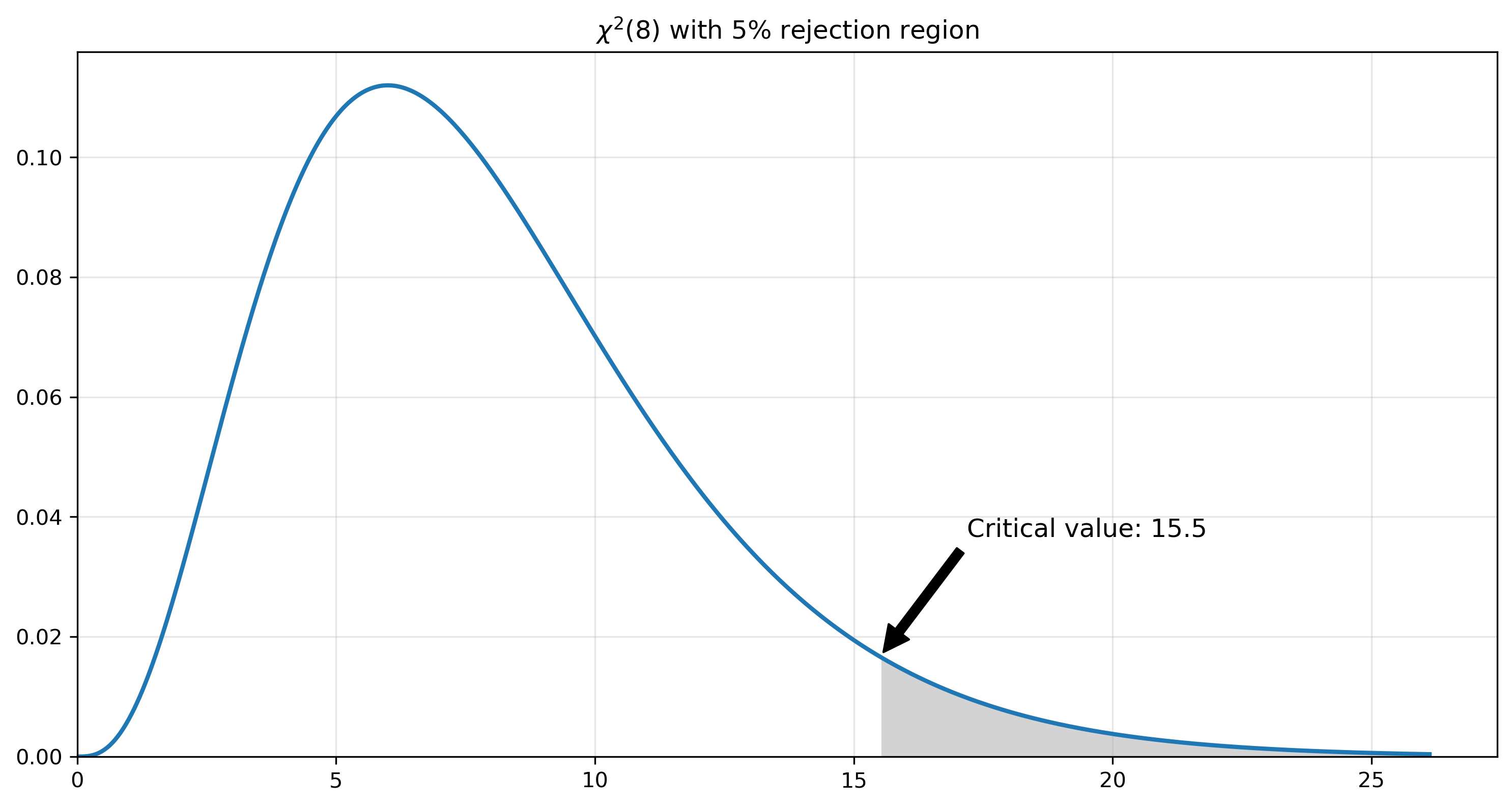
We can calculate rejection regions for any type of distribution. For example, we might calculate a statistic from some data that (under the null hypothesis) has a chi-square distribution with 8 degrees of freedom. The rejection region is shown below. Note that the appropriate critical value is calculated with the .ppf() method of a scipy random variable object.
fig, ax = plt.subplots(figsize=(12,6))

dof = 8  # degrees of freedom

# create a chi-squared distribution with dof degrees of freedom
chisq = scs.chi2(dof)

x = np.linspace(0, chisq.ppf(.999), 500)
px = chisq.pdf(x)

ax.plot(x, px, lw=2)

# fill in the rejection region
alpha = 0.05
cv = chisq.ppf(1-alpha)
ax.fill_between(x[x>cv], px[x>cv], color='lightgrey')

ax.annotate(f'Critical value: {cv:.1f}', xy=(cv, chisq.pdf(cv)), xytext=(cv+4, chisq.pdf(cv)+0.02),
            arrowprops=dict(facecolor='black', shrink=0.04),
            fontsize=12, ha='center')

ax.set_title(fr'$\chi^2({df})$ with {alpha*100:0.0f}% rejection region')
ax.grid(alpha=0.3)
ax.set_ylim(0, None)
ax.set_xlim(0, None)

plt.show()
Exercise
What is the 99% critical value for a \(\chi^2\) distribution with 50 degrees of freedom? First calculate this value with just one line of code. Then, adjust the code above to create a new graph showing the value.
What is the 95% critical value for a Poisson distribution with \(\lambda = 12\)?
Solution
scs.chi2.ppf(0.99, 50)

scs.poisson.ppf(0.95, 12)